JC Penney
Shaping a New Visual Identity During a Brand in Transition
Overview
In 2013–2014, JCPenney was in the midst of a major brand evolution—transitioning from legacy department store to a more modern, style-conscious, emotionally resonant retailer. As part of that transformation, I led the art direction for seasonal campaigns and direct mail pieces, shifting the visual and narrative tone toward something more dynamic, relatable, and refined.
My Role
Art Director for JCPenney Home & Lifestyle campaigns
Led the creative direction for print, digital, and in-store photography
Collaborated with photographers, stylists, writers, and the internal brand team
Managed casting, concepting, layout design, and print execution for weekly and seasonal creative

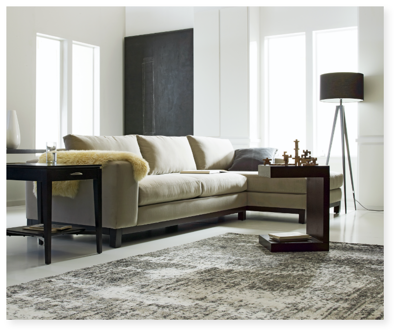
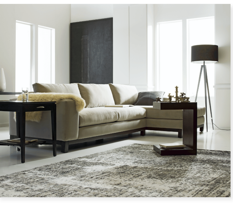
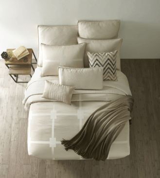
Art Direction Approach
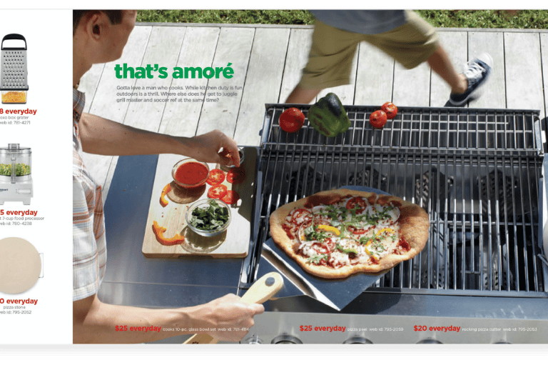
🎯 Concept Shift: Real People, Real Moments
Moodier lighting and shallow depth of field added emotional texture
Subjects were captured mid-laugh, mid-movement, or lost in thought—offering a cinematic quality that felt editorial
Props and environments felt lived-in and intentional, not over-styled
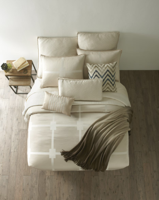
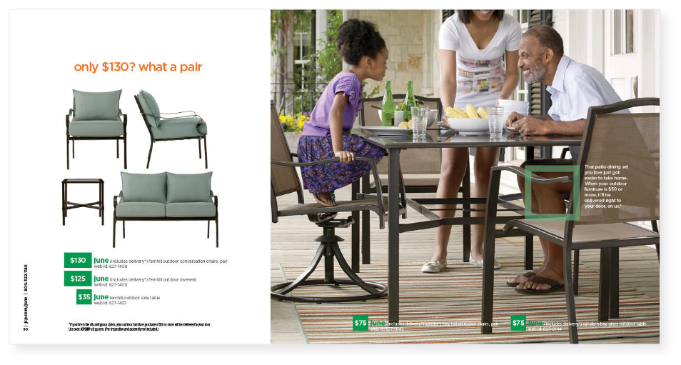
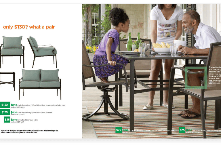
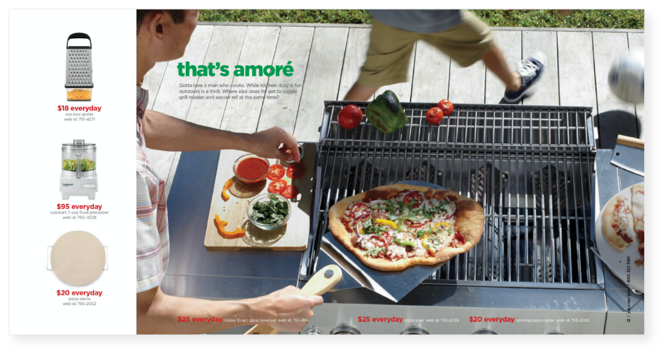
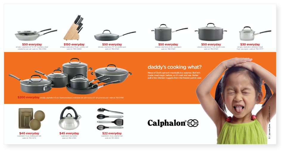
The mailers and catalogs were key vehicles for this visual shift.
We incorporated conversational copy—direct, warm, and first-person in tone
Each spread told a mini-story—from setting a cozy holiday table to welcoming fall with layered textures
I ensured the design language matched the imagery: clean grids, generous margins, and modern type
Outcome & Impact
While the brand as a whole was in transition, our creative work received strong internal support and consumer response:
✨ The “Home” book mailers were cited by merchandising and brand teams as benchmarks for tone and mood
📬 Customers responded positively to the relatable voice and aspirational visuals
📸 The photo style was adopted across other departments as part of the brand toolkit
🔄 Helped reposition JCP as a brand leaning toward lifestyle, not just price
Reflection
This work taught me the power of art direction as strategy—how shifting light, posture, and language can reflect an entire brand’s intent. In a high-pressure retail environment, we slowed things down just enough to tell better, more meaningful stories—and connected with customers not just on the page, but emotionally.
Let's build something together
Reach me at rlcomraddjr@gmail.com or connect on LinkedIn