The Challenge
Moving Money with Gen Z
TL; DR
This demographic is deeply social, value-driven, and expects financial tools to be fast, flexible, and mobile-first. The goal was to reimagine Citi's money movement flows to align with these expectations — from peer-to-peer transfers to collaborative giving — while exploring design territory beyond Citi’s existing brand and UX patterns.
My Role
UX/UI
Team
UX
DD
Tools
Figma
Adobe CC
Keynote
How can Citi stay culturally relevant with a generation that’s growing up cashless, collaborative, and cause-driven?
Gen Z doesn't just use money — they move it. They split bills, request funds, support creators, and give to causes they believe in — often all in the same week. Traditional banking UX feels rigid compared to the fluidity of platforms like Venmo, CashApp, and social-driven payment tools.

"I Venmo money to my friends"
"I don't want a bank account like my mom's"
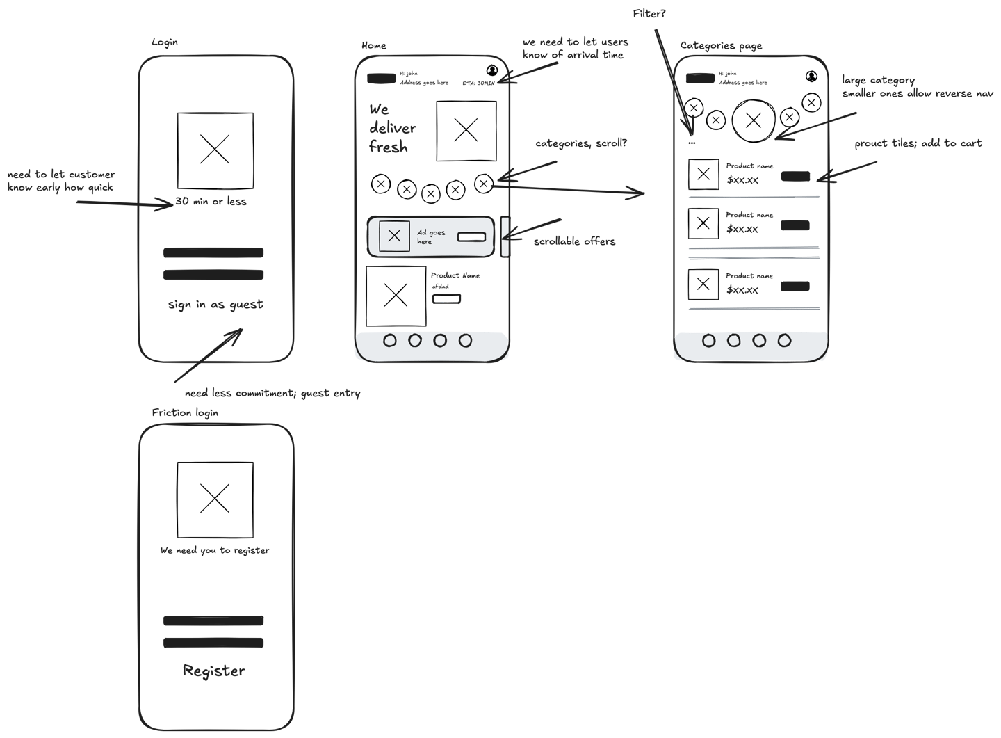
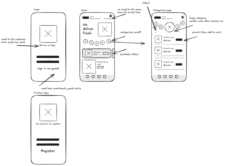
The Research
I conducted secondary research and persona development based on Gen Z’s financial habits, priorities, and app usage patterns. Key findings:
Social-first transactions: Over 60% of Gen Z users prefer P2P platforms that feel social, not sterile. Emojis, messages, and design language matter.
Group dynamics: Money is often exchanged in group contexts — roommates, trips, or friend pods — requiring group request/send features.
Cause-conscious giving: Gen Z actively donates to causes. They want to know where their money goes and be able to share impact.
Brand authenticity matters: This generation gravitates toward experiences that feel real, inclusive, and emotionally resonant.
What It Is
Traditional banking apps weren’t connecting with Gen Z—too clunky, too impersonal, and missing the social values this generation cares about. Citi needed a fresh experience that made moving money feel effortless and giving feel natural—without sacrificing trust or clarity.

What I Did
Key Flows Explored:
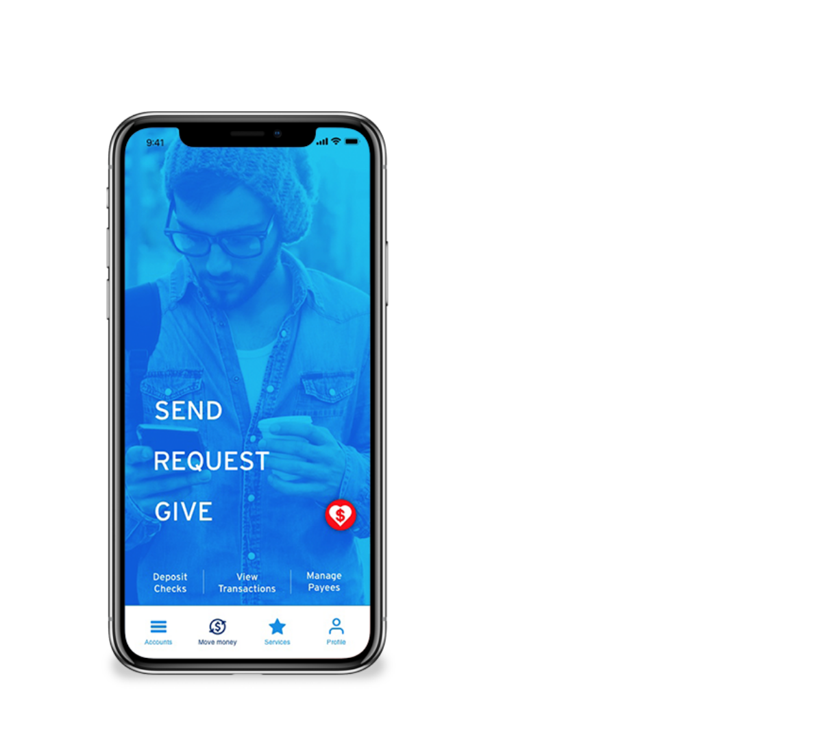
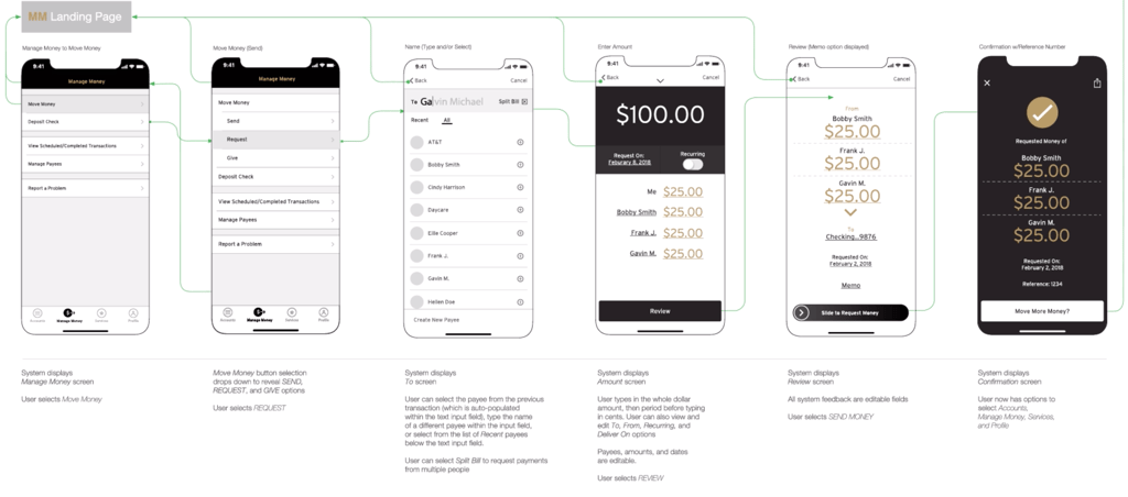
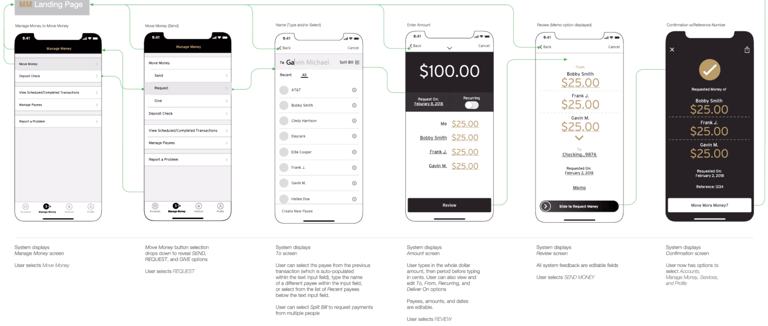
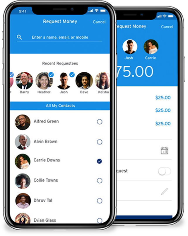
Peer-to-Peer (P2P) Send & Request
Send/request money to one person or a group
Friendly, UI and conversational language
Transaction notes and split calculators built in
Group Requests
Easily split and request from multiple people with visual confirmation
Real-time status indicators: “Sent,” “Viewed,” “Paid”
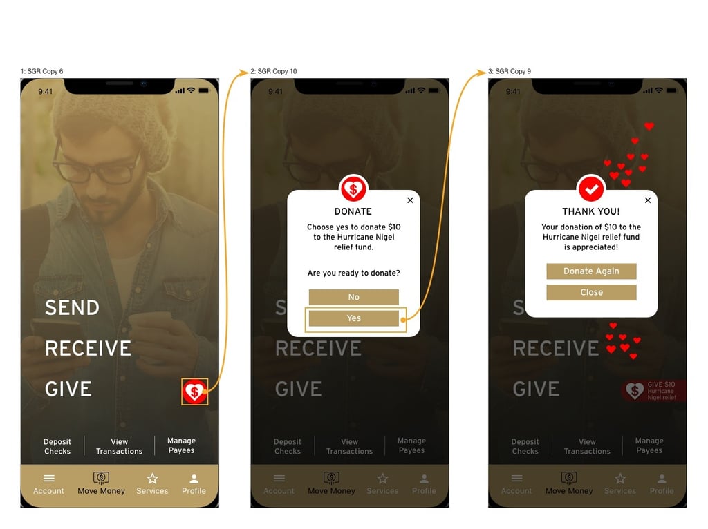
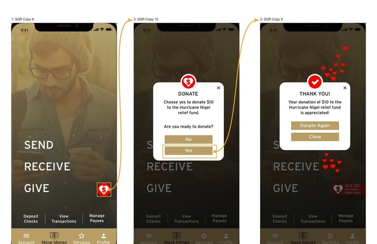
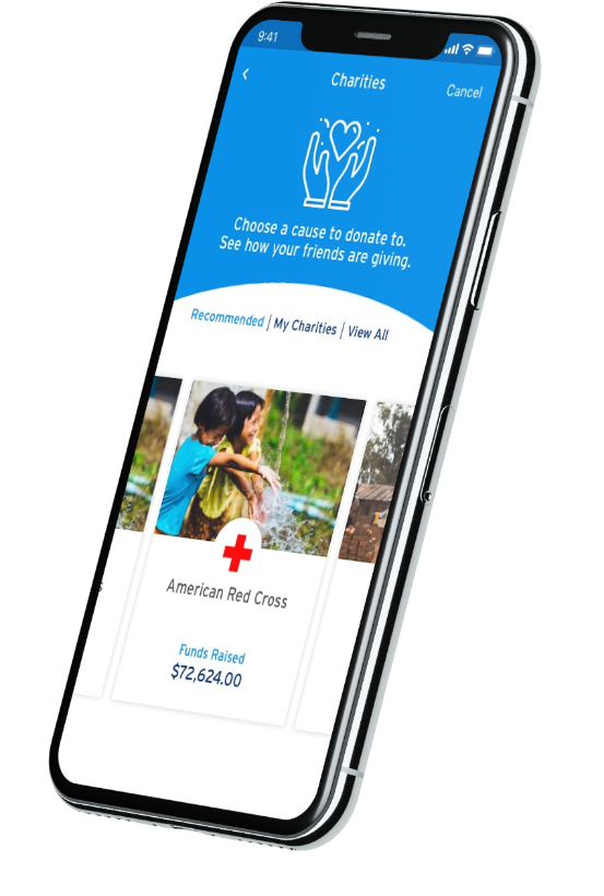
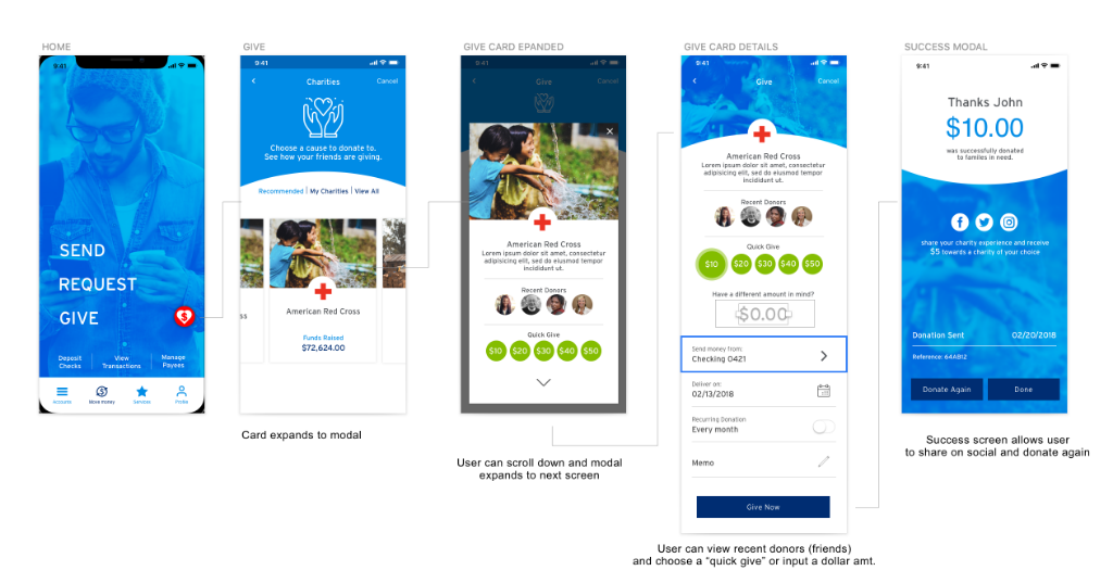
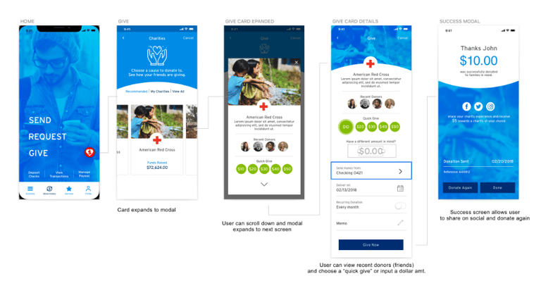
Give Tab
Curated causes Gen Z cares about (climate, equity, education)
Personalized donation suggestions based on spending habits
Impact visualizations (e.g., “Your $5 planted 10 trees”)
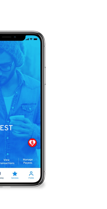
New Look & Feel
Departure from Citi’s conventional design language
Bold gradients, soft cards, microinteractions, and accessible gestures
Designed mobile-first for swipe, tap, and haptic feedback
This concept positions Citi to meet Gen Z where they already are — in a space where money is mobile, social, and meaningful.
Business Value:
Increase Gen Z account acquisition and app usage
Expand into P2P and micro-giving verticals with emotional appeal
Improve perception of Citi as adaptable and culturally relevant
User Value:
Faster, simpler money transfers with modern UX
Builds community through giving and shared transactions
Feels personal, not transactional
Impact
Wires were created simultaneously with branding to move quickly to meet deadline
Updated flow and potential color scheme update for this line of branding
Concepts were tested; ux was a hit, the UI needed improvement-did not resonate
The high fidelity designs were bold and utilized large Button typography that invited users into the things they iterated that mattered most.
Smaller banking actions were on screen as well with familiar navigation to aid usability. The color push was tested but did not resonate with users.


UI was updated to align a bit more with branding and to encourage trust in the positioning. Flows were created to show the donation functionality.
"I love that I can choose who and how to send money"
"The app is actually fun to use"
What was next?

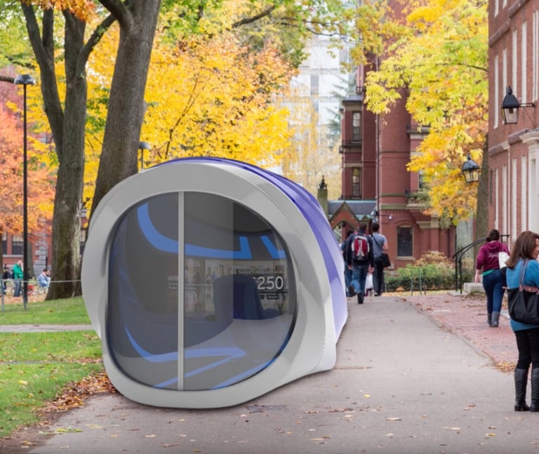
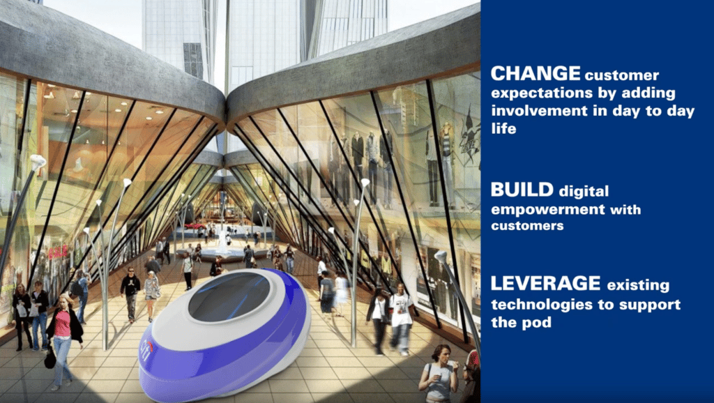
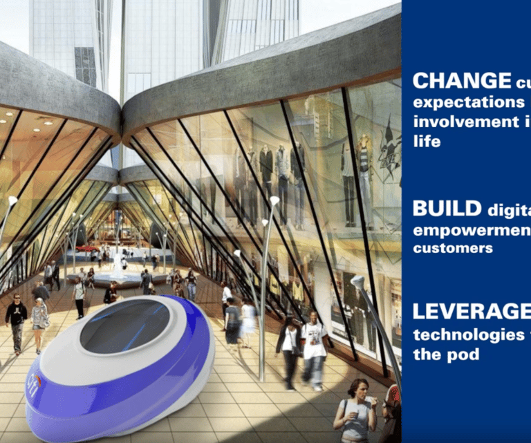
To attract Gen Z beyond digital, I was on a team that explored physical activation concepts that could extend Citi’s reach into high-traffic, Gen Z–heavy environments.
“Citi Pods” were imagined as mobile banking experiences placed on college campuses, at shopping centers, and in urban areas. These futuristic, self-contained spaces offered secure access to financial tools, personalized onboarding, and brand immersion — all tailored to the needs and behaviors of a younger, on-the-go audience.
This concept positioned Citi not just as a bank, but as a brand willing to show up in new, relevant ways
Let's build something together
Reach me at rlcomraddjr@gmail.com or connect on LinkedIn