Citi Prestige Direct Mail
Blending Physical Fun with Digital Activation to Reignite ThankYou Points Engagement
Overview
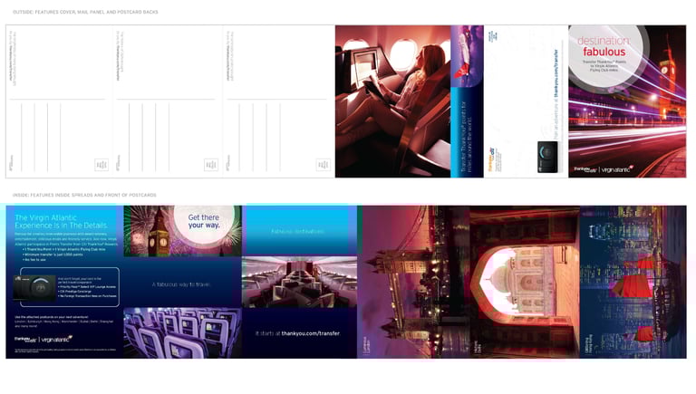
To reinvigorate engagement with Citibank’s ThankYou® Points program, we launched an interactive direct mail campaign that reimagined the physical mailer as a playful, high-touch experience. This tactile piece broke through the noise of traditional marketing by inviting cardholders into a multi-sensory, gamified interaction—bridging the gap between print and digital to create a compelling journey.


Objective
With digital fatigue on the rise, the goal was to:
Drive renewed interest and action around unused ThankYou® Points
Elevate the brand experience through an unexpected and premium touchpoint
Increase online redemptions and program participation
My Role
Lead UX & Experience Designer
Partnered with copywriters, print vendors, and rewards strategists
Oversaw concept development, physical prototyping, and final execution
Designed the end-to-end experience that connected mail to microsite

Design Strategy
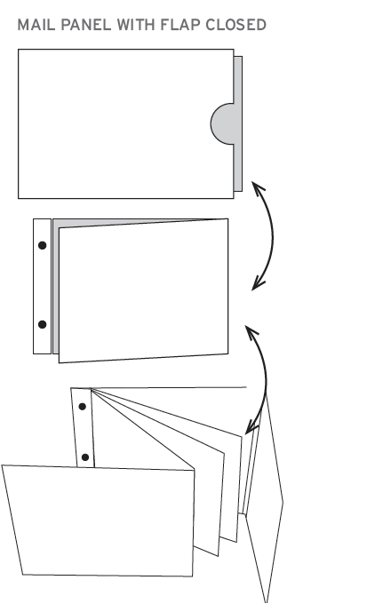
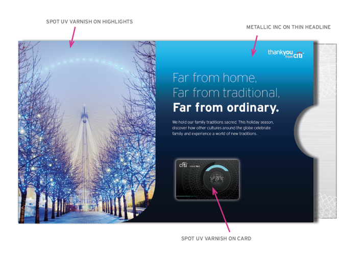
We designed the mailer as a hands-on experience—intended not just to be read, but played with.
✨ Fun Meets Function
The mailer included a removable panel that revealed a secret message and QR code underneath—turning passive mail into an active moment of discovery. The tone was light, energetic, and subtly gamified..
Experience Design
Stage 1: Intrigue
Beautifully designed exterior with dimensional form factor
Teased benefits of ThankYou® Points without overwhelming
Stage 2: Discovery
Reveal with branded messaging and hook to travel and utilize points
“You’ve got points waiting—come see what they can do.”
Stage 3: Activation
Displayed URLs led to a mobile-optimized microsite
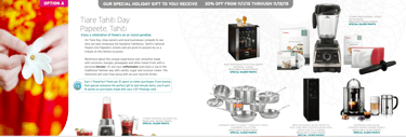
Personalized dashboard showed points available + suggested redemptions
Social sharing option encouraged community engagement

Insights & Results
226% increase in transferred points within the first month
42% of redemptions from members who had never redeemed points before
2,768% increase in page visits to the Points Transfer website
134% more page visits in the campaign year compared to the second half of the previous year
What Made It Work?
✅ Emotion-led design: It didn’t just inform—it delighted
✅ Premium tactile cues: Gave weight to the message and brand
✅ Simple digital CTA: A seamless bridge from print to action
✅ Interactive mechanics: The removable element created curiosity and a sense of reward
Reflection
In an age where inboxes are full and attention is fleeting, thoughtful physical experiences still cut through—especially when they lead seamlessly into personalized digital journeys. This project was a masterclass in using UX thinking across media to deliver both surprise and measurable impact.

Let's build something together
Reach me at rlcomraddjr@gmail.com or connect on LinkedIn