Citi
Banking Gen-Z
Designing a Financial Experience for the Most Connected Generation
Overview
As Gen Z continues to emerge as a dominant financial force, banks must evolve to meet their expectations: speed, flexibility, purpose, and personalization. This project focused on designing a modern digital banking experience that goes beyond balance checking — one that supports money movement, micro-social interactions, and purposeful giving.
The Challenge
Traditional banking apps weren’t cutting it for Gen Z.
They expected:
Instant money movement (like splitting a check, paying a roommate, or collecting for a trip)
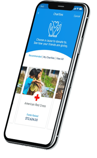
Purpose-driven finance, including donating to causes and tracking impact
A social connection to money — not just cold transactions
We were tasked with reimagining a mobile-first banking product for this generation — integrating social utility, purposeful design, and the speed of modern apps like Venmo, Cash App, and Zelle.
My Role
Lead Product Designer
Drove design strategy and vision from discovery to high-fidelity prototype
Led whiteboarding workshops, low- to high-fidelity wireframing, and UX testing
Collaborated closely with Gen Z research groups, marketing, and engineering


Research
We used a human-centered design approach with an emphasis on co-creation and lightweight experimentation.
🧠 Whiteboarding
We ran in-person and remote workshops with Gen-Z college students and early-career professionals. Using Figma’s FigJam, we mapped out:
Emotional drivers of money movement (trust, speed, visibility)
Key moments when splitting or requesting money matters most (e.g., food, trips, subscriptions)
Interest in social accountability through giving and shared goals
🧩 Wireframes & User Testing
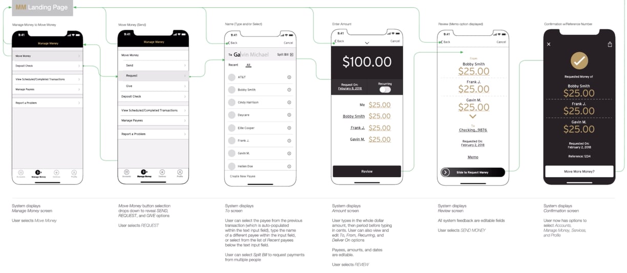
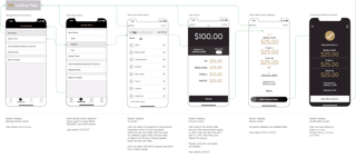
I designed early wireframes focusing on key flows:
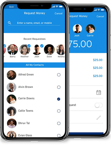
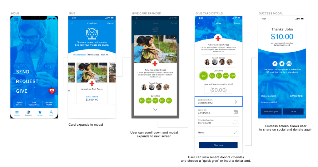
“Split It” after a purchase with friends
“Move Money” tab for fast P2P or charitable transfers
A gamified tracker for monthly donations or causes supported
Feedback from user testing led us to:
Add auto-calculated splits with adjustable contributions
Enable emoji-style reactions on fulfilled payments
Make charitable giving visible but private-by-default
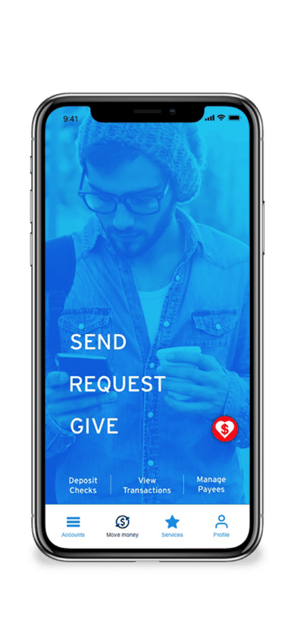
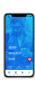
Visual & Interaction Design
Soft tones, organic shapes, and inclusive illustrations reflected Gen-Z's preference for friendliness and authenticity
Motion micro-interactions reinforced feedback and flow confidence
Data visuals showed not just account balances, but impact metrics, like "You’ve donated meals for 12 people this month"
Results
Though the product was still in early concept/prototype phase during testing, feedback and metrics showed:
+72% of users preferred the app over their current P2P tool for its social design
84% of users said they would use the donation feature monthly
92% satisfaction score during prototype testing of the “Split It” experience
What I Learned
Designing for Gen-Z requires empathy for expression and values alignment—not just utility. Money, to them, is a social tool as much as a financial one. By enabling trust, transparency, and purpose in every flow, we moved beyond “banking” and into life facilitation.
Let's work together
Let's connect on LinkedIn and create together!
rlcomraddjr@gmail.com
© 2025. All rights reserved.